Tag Archives: Florida
Color Vibe Coke
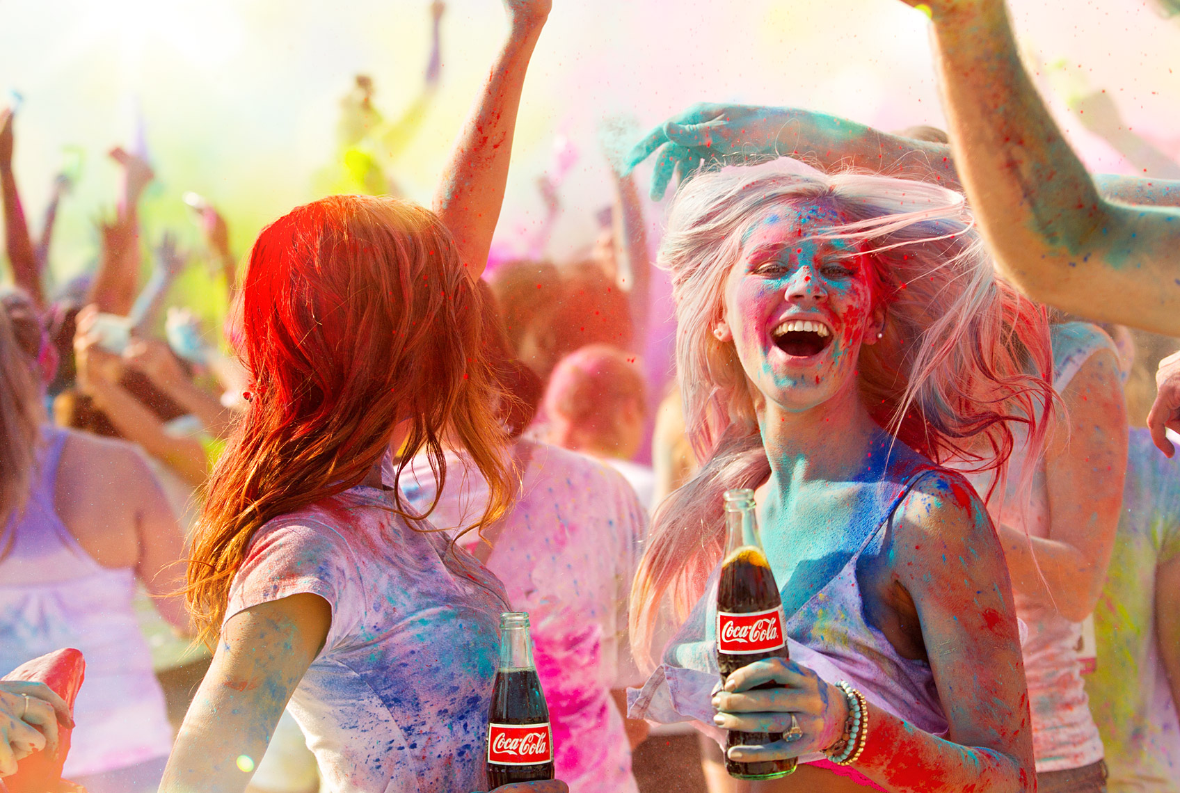
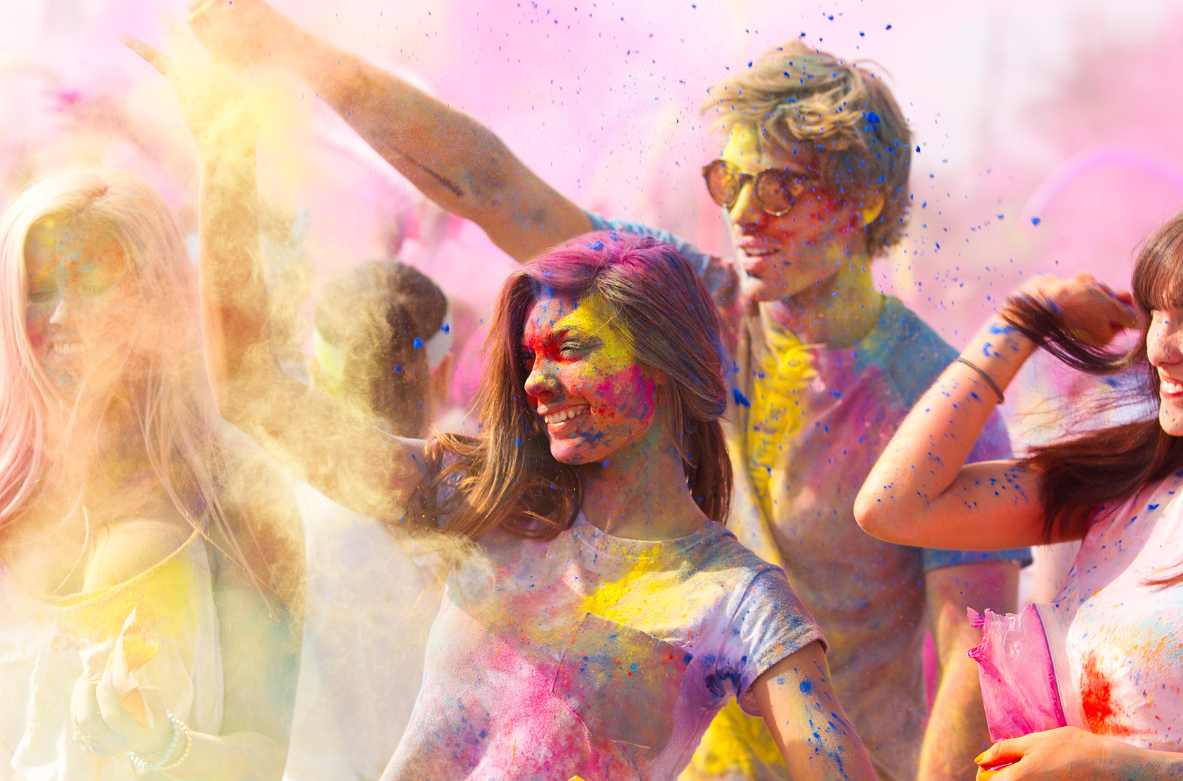
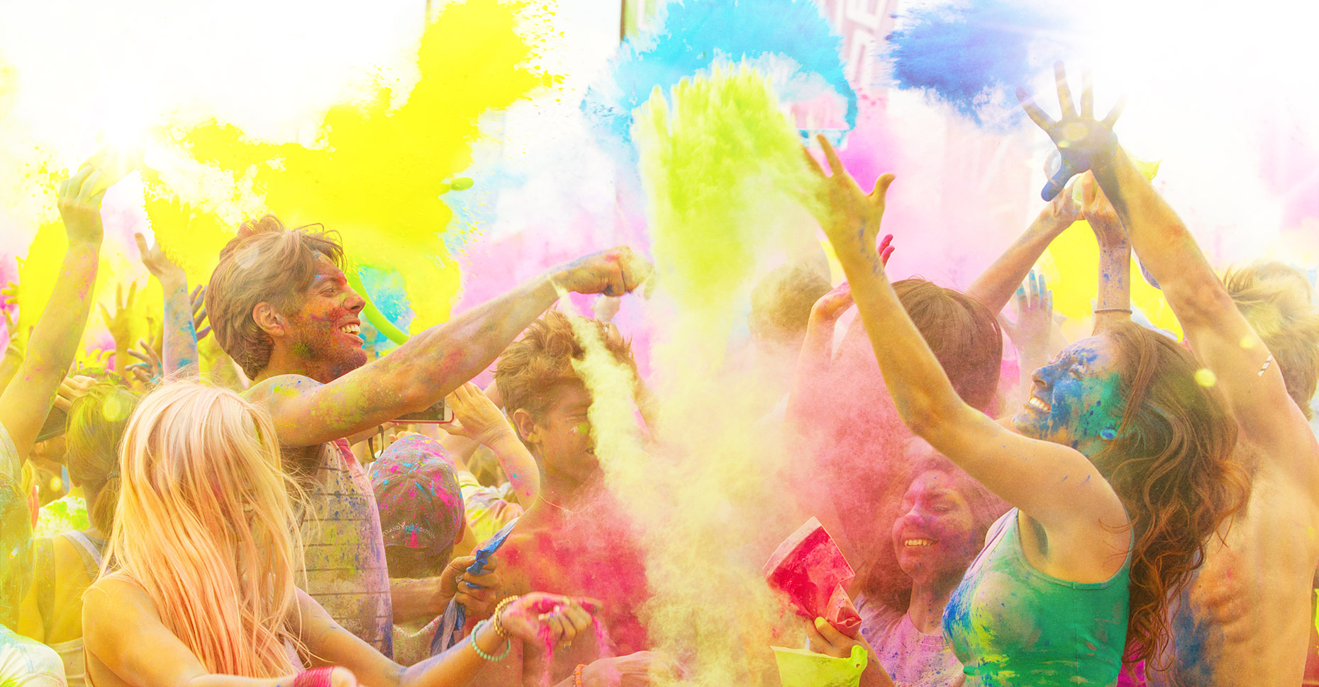
So my most recent lifestyle portfolio project is one that is all about color and energy. Back about a year ago, I was shooting at the Color Vibe 5K run and got some good images but thought that it would be even better to come back, and this time bring a handful of young models along with me to recreate the scene, but with a bit more control. This way I could provide them with direction and guide the energy the way I truly wanted it. It also gave me an opportunity to throw in some products and skew it a little more toward the commercial side so that it’s appropriate for my potential clients. This one ended up targeted toward Coke, as I and my reps have had several RFP’s and estimates this year for several large Coke projects, both for national and international campaigns. We’re actually up for two more as we speak. (fingers crossed!) The idea for this latest project was inspired by the traditional spring Holi festival. See below and more images to follow: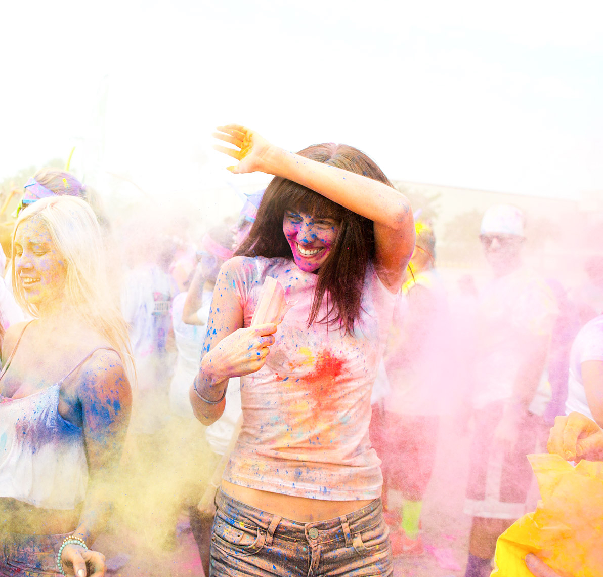
The inspiration for this event was of course the Holi Festival. It started as a celebration of the victory of the good over the bad and the beginning of the spring in India. It also happens to be super fun and has evolved into events ranging from private parties to festivals. People have just taken the idea and run with it, which has turned into a fun thing to do.
In this case, we used a Color Vibe 5K Run as our backdrop so that we could get the depth and volume of people to add to our background. Having shot the event last year, I knew there were going to be thousands of people there covered in color and getting crazy in the after-party of the run. I just brought in seven of my own millennial, ‘twenty-something’ models, our own giant box of multicolored powder and put them in the middle of the masses and directed them to have a great time. They kept throwing color and dancing to the music of the DJ that the venue had on the main stage. The models were awesome and really had a fun time with it.
I am planning a follow up to take this project one step further, shooting a motion version, all in variable speeds ramping from normal speed to extreme slow mo. The inspiration for this (more for the effect of the powder not the actual subject) is a great video on Vimeo that the folks at Variable did http://vimeo.com/40123818 I’ll be sure to share the results once we shoot it!”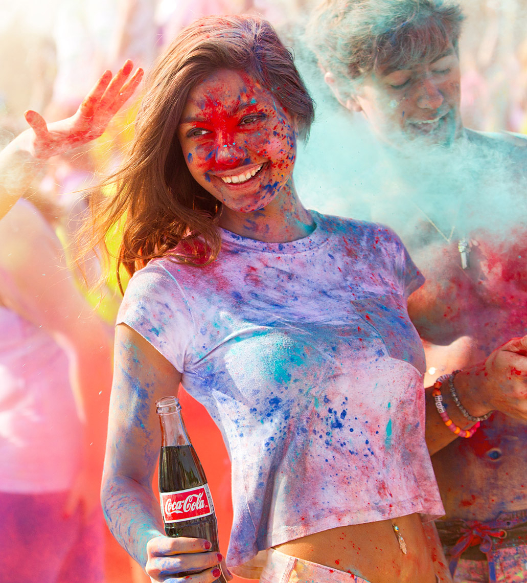
Triathlon
Behind the Scenes Stop Motion Video – New Balance Shoot
Here is a little stop motion behind the scenes video we did from the New Balance ad we shot for Mullen last spring.
It’s Christmas at Casa De Barrett!
 Hard to believe another year is coming to an end so soon. Time seems to be flying by. Thanks to everyone for a great year. Here’s to an even better 2011!
From Pete Barrett and family, (Pick your favorite…) Merry Christmas, Happy Holidays, Happy Hanukkah, Happy Quansa, and for you Seinfeld fans… Happy Festivus….. A Festivus for the rest of us! 🙂
Traveler’s Takes the Scary out of Life.
 So we recently had the opportunity to work with SapientNitro on a great job for Traveler’s Insurance. The job required shooting a guy from “the other team” pulling into a parking lot full of a sea of “home team” cars. Being the only person from “the other team” can be somewhat disconcerting to say the least. This tied in perfectly with Traveler’s tag line which is “Travelers takes the scary out of Life”.
Logistically this job was very complex. How do you get control and ability to prop an entire parking lot full of cars, fill it with fans and shoot a generic large stadium? Click more to read on… Continue reading
Hey Mom, Watch This!!!
 We teamed up again with Smalldog Imageworks to do this new image for the portfolios. That is actually my son Jordan jumping his little Huffy Rocket bike with the big training wheels. We also recruited some of the neighborhood folks to be his audience. Click here to see it bigger.
1st Visit Florida Print Ads
Heli Shot over the Everglades
 Did some heli work shooting Airboats in the Everglades the other day for VISIT FLORIDA shooting stills for a print and for a TV campaign. Here’s a series of production stills of us making a low pass over the airboat shooting for TV.
Technically Speaking: How we made the magic for Miami CVB Tourism:
Mural Shot:
As with all of the shots, we were tasked with combining the art of the selected artist with a location that could represent a particular part of Miami. As Miami has many different areas, these areas must be represented in some way in the various ads. This one was set in Coconut Grove and was to portray the feeling and flavor of the Grove experience. The Grove got it’s start as a sort of artsy area and has evolved over the years to a place where you can go and eat at various outdoor cafes, enjoy the nightlife, catch some live music, etc…
This shot was to show people eating outdoors at a café on the corner with a large painted urban style mural of a musical party on the facing wall. It was to look like late afternoon, moody, almost twilight. There are two people running on the sidewalk and actually jumping into the mural. In this situation, real life meets the art and art meets real life. This is repeated with the city skyline in the mural itself where it blends with the buildings and trees.
As with most of the shots in this campaign, we photographed several different elements to create the final image. Once all elements were shot we handed them off to retoucher Michael Kerbow from Skeleton Studios to create the composite.
We scouted a location that had an outdoor café with good light exposure from the east so we could shoot it and fake it for late afternoon. To save money on talent, the café people are actually people from the creative department from the ad agency. One of the models did not show up for the shoot so the left girl seated is actually shown twice but no one seems to notice. The running models were cast from a talent agency. We shot these models running and jumping separately on white seamless at a different location on another day to simplify the on location shooting. To the right of the frame was actually a driveway of brick pavers that led to a parking garage which started right where the girls rear foot touches the ground. We shot a side of a building elsewhere that would match the perspective and texture of the wall that we wanted to lay the mural on in post. This would make the mural painting look like it was actually painted on a real wall not just stripped in. We also shot multiple condo buildings and trees so that we could have them peeking over the building and melding with the mural.
The mural artist (Danny Fila) provided us with several pieces of artwork (from an album cover artwork he had done) that Michael then pieced together to create the wall mural. Careful attention had to be paid to create enough space for the models that were to jump into the painting. We had Danny paint additional art that could be incorporated into the frame as well, such as her painted arm, torso and leg, extra musical notes and a custom city skyline that we could match with the condo buildings and trees we shot. Once Michael had composed the scene in post, I asked him to darken it slightly overall to addto the late afternoon mood and also to add one extra ceiling fan and turn on the lights digitally as they were off when we shot them.
From there the image comes back to me for final color palette exploration and adding of the illustration and painterly effect. * When viewed closely at 50% or larger on the master files you can begin to see how the image was transformed into more of a painterly look where it almost starts to look like an actual painting where the pixels actually flow more like fluid paint than photo pixels. (see detail enclosed)
South Beach Waves Shot:
The Artist who’s work is featured in this ad is name Avner Zabari. He creates whimsical art furniture that is very much influenced by Miami and it’s architecture and landscape. (or waterscape in this case) See http://www.avner.com/showroom/index.php?item=166&prod_year to see the original piece before we altered it. In this ad we had to combine shots of the benches (which would make up a sea of waves) with a model diving, the Art Deco skyline view of South Beach (from over the water perspective) and sky.
Creating the classic skyline view of South Beach turned out to be much more demanding than one might think. In recent years, the city has planted a zillion palm trees between Ocean Drive and the beach. You no longer can see the Art Deco buildings from an aerial perspective over the water like you once could. To get around this we did several things. We scouted and shot some from a helicopter but it became apparent that there was no way to create this view by shooting it this way. The client purchased the rights to an old stock shot that had the basic angle and look of the scene we wanted. The problem was that the proportions were all wrong… it was not nearly wide enough to cover the wide canvas that we needed. To get around this, I went to South Beach and shot many of the buildings straight on and at slight angles to get a myriad of “puzzle pieces” so tospeak, so that we could add buildings to extend the canvas to the proper proportions. Special care was taken to ensure we got the correct approximate time of day so that the lighting would match the overall scene and thebits of the stock shot that would be used alongside my original artwork. We shot the diver jumping on a trampoline against a white seamless background. It was lit from below so that when you invert him in the computer to the correct diving position, he would be lit from the correct angle by the “sun”. Lastly the furniture itself was shot at the artist’s studio. The challenge here was that he only had 8 benches and the ad requires well over 100. We set up the 8 benches and shot them repeatedly at different positions and perspectives to give ourselves plenty of originals to use in composition. Shooting many distances and angles allowed for proper placement in the composition where the perspective has to match and look as if it is really receding into the background.
Once all pieces parts were shot, the task of assembly went to our retouching team. We were under extreme time deadlines on this one as the client had media placement deadlines that were looming. Michael started by putting together the benches, I knocked out the diver and delivered it masked to him. To save time we hired a retoucher out of NY who put together the preliminary building shots to form the background plate, Michael then extended this plate due to a last minute proportion change. Once all the ocean waves had been created using a sea of benches, Michael finished the composition of the final shot and sent it back to me for final color pallet exploration and illustration and painterly looks to be applied by me here in Florida. . * When viewed closely at 50% or larger on the master files you can begin to see how the image was transformed into more of a painterly look where it almost starts to look like an actual painting where the pixels actually flow more like fluid paint than photo pixels. (see detail enclosed)
Pool Strawberry shot:
This shot was to represent the culinary art of Chef Heddy Goldsmith. The Miami location represented is the pool of the historic Raleigh Hotel on South Beach. The creative challenge on this one was to create a pool full of strawberry dipping sauce and fill the Raleigh pool with it. We shot the pool location and models first. As most of the talent was going to be small we actually shot the same 4 models multiple times. We just re-dressed them in different wardrobe and shuffled their positions around the pool. I have done this many times when working with large groups that are virtually non recognizable and it works great to save money on talent. The material for the sauce was created by a food stylist in studio in a custom made Plexiglas container that we made special to recreate the perspective we needed. The original creative called for a mango sauce which is one of Heddy’s specialty creations, but the brownish orange color made the pool look more like a sewage treatment facility than an enticing sweet pool, so a creative decision was made to color correct the liquid to a pink. A hand model was hired to dip various fruits into the sauce. Our retoucher Michael then combined the elements and added reflections then the images was returned to me to explore and set the color pallet and add the illustration and painterly effects.
Orchid Dancer Shot:
This shot was to represent art of urban dancer Zedric Bembry. The creative here required a composition of multiple shots of Zedric to be put together in a way that made him create an orchid flower. The location setting was that of the mangroves in Everglades National Park.
The first objective on this one was to scout and shoot the mangroves, I wanted an area where I could flank the dancer on either side with a border of mangroves and have a visual path to guide your eye into the shot (which we placed the flower and dancer) to give it added depth and dimension. The background is made up of 5 different shots.
To set the direction of the dancer shot, we first had to pick which Orchid we wanted to shoot. There are literally hundreds of various species of Orchid plants. This one was picked for it’s vibrant color and fluid shapes. The flower & stem itself was shot separately in studio and created from 3 different plants to form the shape and composition we wanted. Where the flower bud meets Zedric was actually a blend of the bud and part of his body to start the premise of him being the flower.
We spent the day shooting Zedric in the studio. We had him jumping and hitting various dance poses which we then began doing low rez comps of the different dance positions while on set. This allowed us to create each piece that we needed to emulate the flower as close as possible. Custom made body suits and materials were used to give the color we wanted and also to create the illusion of flower petals. The center most prominent image of Zedric was styled in a more urban style to fit who Zedric really is.We opted for the more serious expression as it showed the concentration he exhibits when dancing. Smiles looked too posed and cheesy.
Again, composition of all elements were made by Michael Kerbow of Skeleton Studio, then finishing work such as final color pallet exploration, illustration and painterly effects were added by me.
Beach Sculpture Shot:
This image was created using a large wooden sculpture of letters that were placed into position on the beach then we sprayed the entire piece with spray glue and covered it with sand to make it look as if it had been sculpted entirely out of sand. We then styled the beach and placed our children around it. If you notice there is a multi ethnic mix of children used to signify the cultural melting pot that is Miami.

